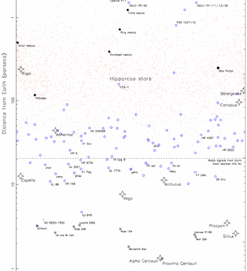
The picture above is a portion of a much larger map developed by astronomers at the University of Princeton that maps the whole universe using a logarithmic scale. Using a logarithmic scale when mapping stars is essential. Think about the distances of all the different stars in the universe. Some are relatively close to us on Earth, but some are amazingly far away. Hence, graphing these distances in a linear system would be terribly inefficient because if your scale to measure the distance of the stars was, for example, 10 light minutes, then stars close to Earth like the Sun would show up close to the origin on the graph. However, there are stars that exist billions of light years away from the Earth. So graphing these stars on a linear system would mean that your x-axis would have to be impossibly long. Instead, as demonstrated in the picture above, astronomers use a logarithmic scale...so they could have an x-axis with tick marks 1, 2, 3, 4, 5, 6, 7, .... and each of these tick marks would represent the common logarithm with base 10. So the 1 tick mark on the logarithmic scale would represent logx=1 which solves to be x=10 because 10^1=10. So a tick mark of 1 for astronomers means 10 light years. A tick mark of 2 means logx=2 which solves to be x=100 because 10^2=100. Tick mark of 3 would be 1000, tick mark of 4 would be 10,000, 5 would be 100,000, 6 would be 1,000,000 and so on. This allows astronomers to take starts with distances so far apart from one another and map them in a way that allows them to fit in one graph.
